Anita Jain is a women’s fashion and home wear boutique.
Anita Jain’s vision in coming years is to expand only in silver jewellery.
Style is heavily inspired by “banni thanni” art from Rajasthan and is a replication of the founder itself. Apart from it adding great aesthetic value, the style has a deeper meaning as the collection of the brand gets designed and manufactured in the capital of Rajasthan, Jaipur.
A mascot logo tells consumers that the brand is a people’s brand, it adds life to the logo and is easier for people to connect to.
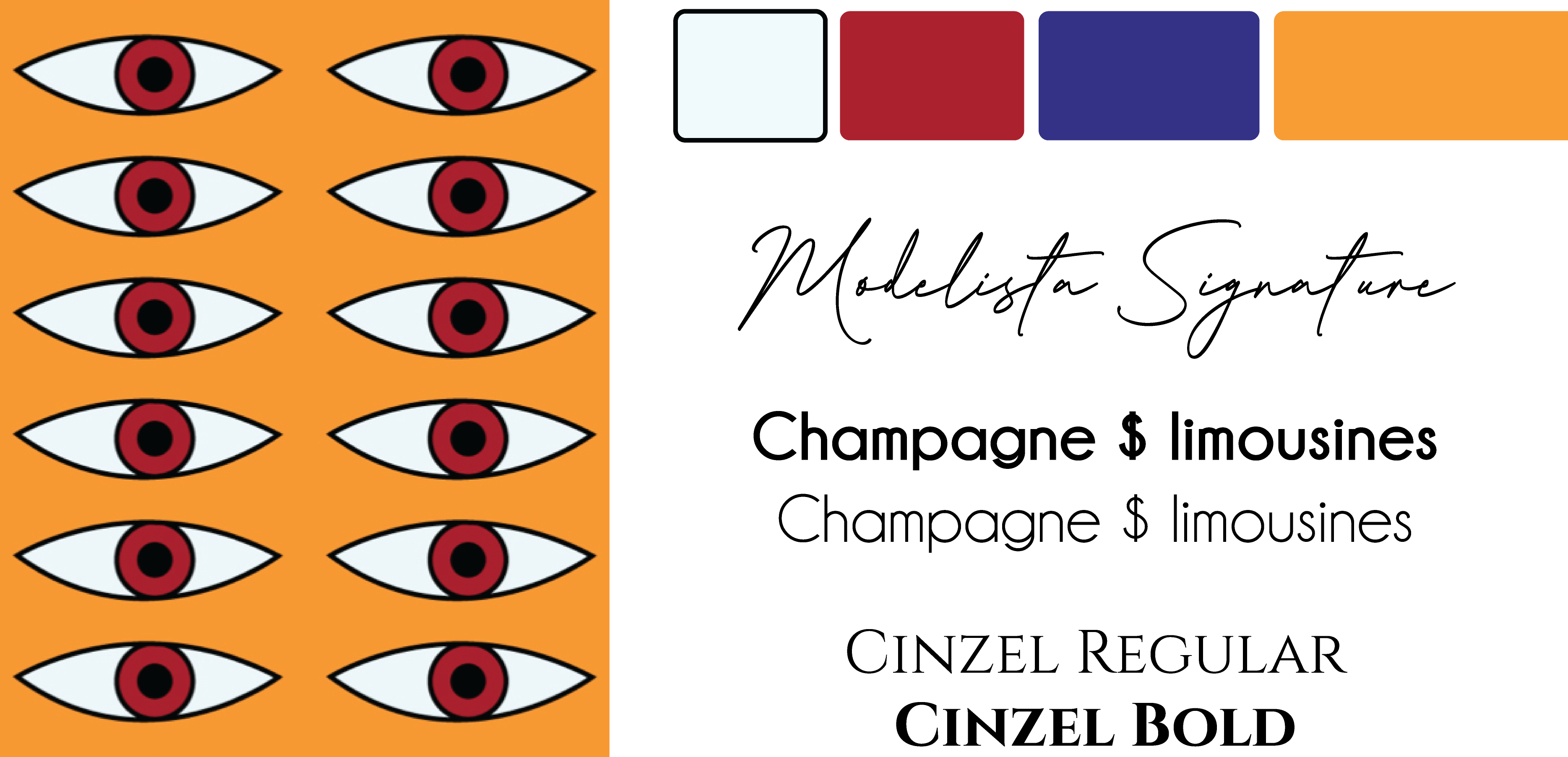
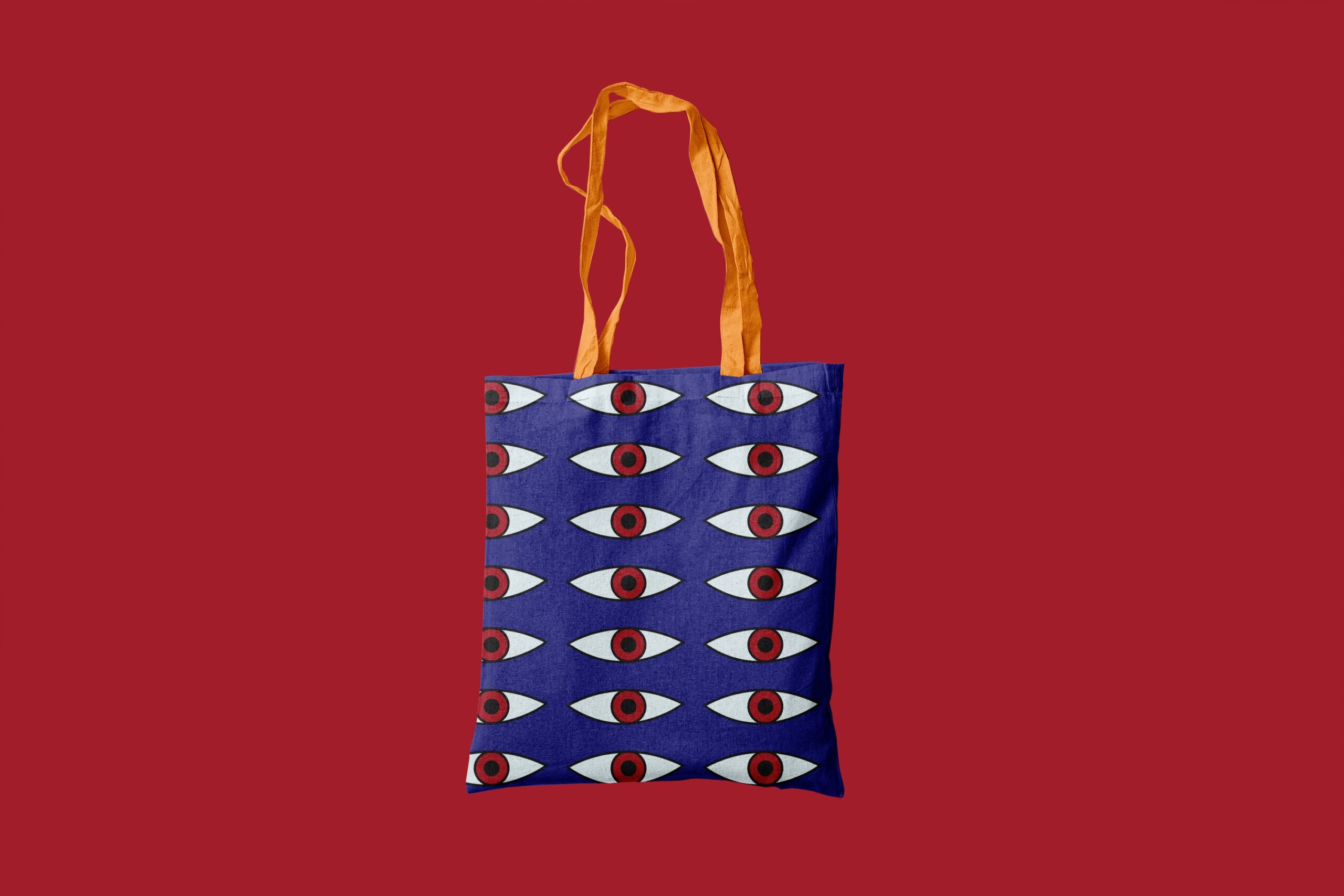
“Eye looks for eye”
The eye from within the logo has been taken out as the brand motif.
“Eye looks for eye”
The eye from within the logo has been taken out as the brand motif.
Warm color palette to portray coziness and warmth.
A graceful and full of personality signature font along with 2 clean and minimal san-sherif fonts to balance it.
Warm color palette to portray coziness and warmth.
A graceful and full of personality signature font along with 2 clean and minimal san-sherif fonts to balance it.
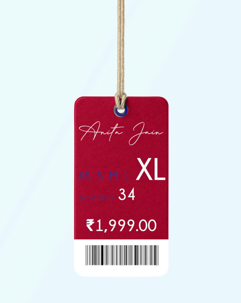
A very user friendly,minimal tag to convey the necessary.
A very user friendly,minimal tag to convey the necessary.